Dashboard Design
Part of Executive dashboard design
Designing a dashboard that explains exceptions
An exception tile should tell a leader what changed, whether the data is trustworthy and who is investigating.
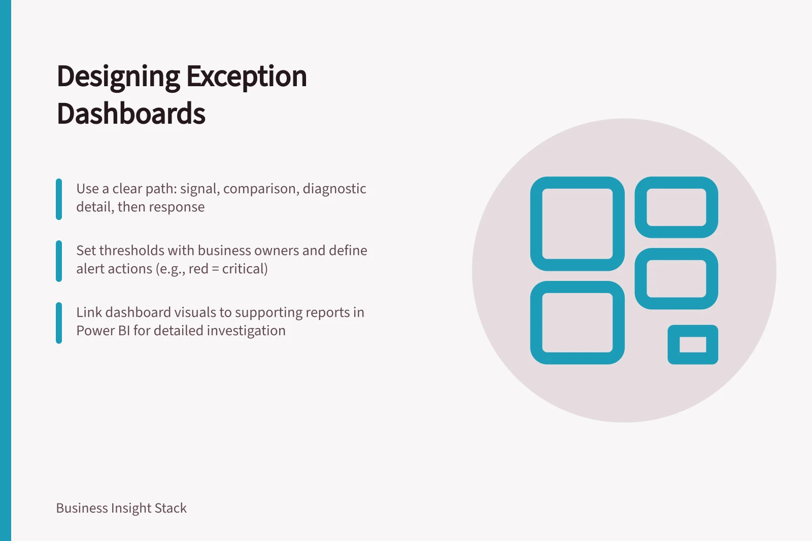
Build an exception indicator as the first step in a path: signal, comparison, diagnostic detail, then response. A red value without that path creates urgency without helping the viewer decide what is wrong, what remains uncertain or who is investigating.
Connect signal to diagnosis
For each threshold, define the next question the viewer needs to answer. If service time rises, provide a breakdown by queue, product or region; if revenue misses plan, make it possible to separate volume from price and mix.
Map each question to a route into supporting detail. An Australian retailer checking sales against forecast could move from the exception to comparisons by location or product, then into a detailed report to investigate the change.
In Power BI, keep the dashboard to a clear overview and use its link to supporting detail: selecting a dashboard visual takes the viewer to its underlying report and semantic model. Microsoft recommends keeping detailed segmentation in a linked report rather than crowding the dashboard.
Give the tile enough context to make the alert interpretable: the measure and current value, its threshold or target, its exception state and a compact trend. A line chart or sparkline can show movement over hours, days or weeks, with a historical average or target as a comparison.
Add a dated annotation for a known cause or data caveat, such as a delayed source load, policy change or operational incident. Do not label a plausible explanation as confirmed; if the cause is unknown, mark the exception as under investigation and name its owner.
Key Dashboard Elements for Exception Tracking
- Measure
- Service time, revenue, temperature
- Exception Status
- Red (exceeded), under investigation
- Owner
- John Smith (Maintenance Team)
Historical Trend with Annotation for Known Events
- 9Oct 2026 — Delayed data load from production system
- 5Oct 2026 — Policy change in GST reporting compliance
Distinguish alert from action
Set thresholds with the business owner and agree what crossing one means: monitoring, escalation or an immediate decision. For example, a temperature above 80°C can be flagged; red can indicate critical, yellow a warning and green normal.
Check whether the alert gives useful context over time. Trend views can reveal gradual changes, and zooming or filtering lets the viewer examine a closer period; comparisons with historical averages or targets help put the movement in context.
For a manufacturing plant, a tile could flag a machine temperature above 80°C in red and link to its trend and supporting detail. Compare the movement with a historical average or target; if the evidence does not establish a cause, keep the status under investigation and name the owner rather than guessing.
Test the exception path in a real meeting. Ask whether participants can identify what is wrong, what remains unknown and who will follow up; if they need a separate spreadsheet, improve the route to the underlying detail rather than crowding the overview.